First, we had a sample color matched to what we thought was a lovely, soft sage color from Alex’s uncle’s house. The sample turned out to be the pukiest green ever! When our friend Allison saw the sample square on the wall, the first thing she said was “You’re not going to paint the room that color, are you? It looks like barf!” And then our neighbor came over and asked “So you’re replacing minty with vomit?” No, we were definitely not going to paint the walls that color.

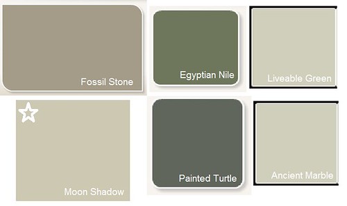
The next round of samples weren’t right either. We picked three dark greens, “Painted Turtle” (Behr), “Egyptian Nile” (Behr) and “Fossil Stone" (SW), and three light greens, “Svelte Sage”, “Ancient Marble” and “Liveable Green” from Sherwin Williams. But they were either too dark or too light. Duh.
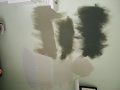
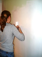
By the way, color samples on the wall do not look like the paint chip which do not look like the color on your computer screen. Plus, testing new paint colors on top of minty/puke green background didn’t help. So we got smart and primed an entire wall to have a clean, primer white surface for contrast.
Feeling a bit discouraged, we turned to magazines for inspiration and found an article about a living room makeover. It looked like the perfect paint color—and it listed the color name and brand!
Off to the local Benjamin Moore store we went. We confidently went to the paint chip wall, and grabbed the card for "Polar Sky". However, the magazine had listed the paint color with the wrong name! What the magazine said “Polar Sky” looked like (creamy sage) was not what the paint chip looked like (frosty blue). Luckily, a very helpful sales lady came over to help. I explained the rather long list of requirements for the color (not minty or pukey, gray undertones rather than yellow, not a beige) and she suggested two perfect colors - Moon Shadow (1516 Ben Moore) and Grant Beige (HC-83 Ben Moore).
We painted the samples on the the freshly primed wall next to a sample of our kitchen color (Tea Light SW). And, though these two samples both looked the same to Alex (he's color blind!), we finally had a winner!
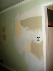
Moon Shadow by BM was exactly what we’d been searching for. It looked great with the ceiling color we’d already decided to continue from the kitchen, “Alabaster” in Harmony (Low VOC) by Sherwin Williams and for flow, looked good next to the Tea Light from the Kitchen. Since the rooms are right next to each other, we thought it would be good to have the colors coordinate from one room to the next.
If you've had a rough time picking out paint colors or just want to comment on our unfortunately long color picking process, let us know in the comments below!


No comments:
Post a Comment